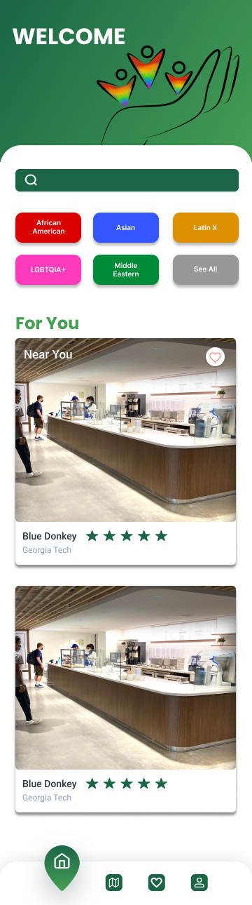
For The People is an app in development that specializes in creating a space where small businesses can be recognized. Discover small businesses using socioeconomic filters, review and rate businesses, and favorite your favorite businesses.
The Problem
The Solution
Over 50% of small businesses fail within their first five years due to the competition and lack of exposure.
We wanted to create a safe space for these small minority businesses to thrive and give users a convenient place to find and support these local businesses.
Our Client's Vision
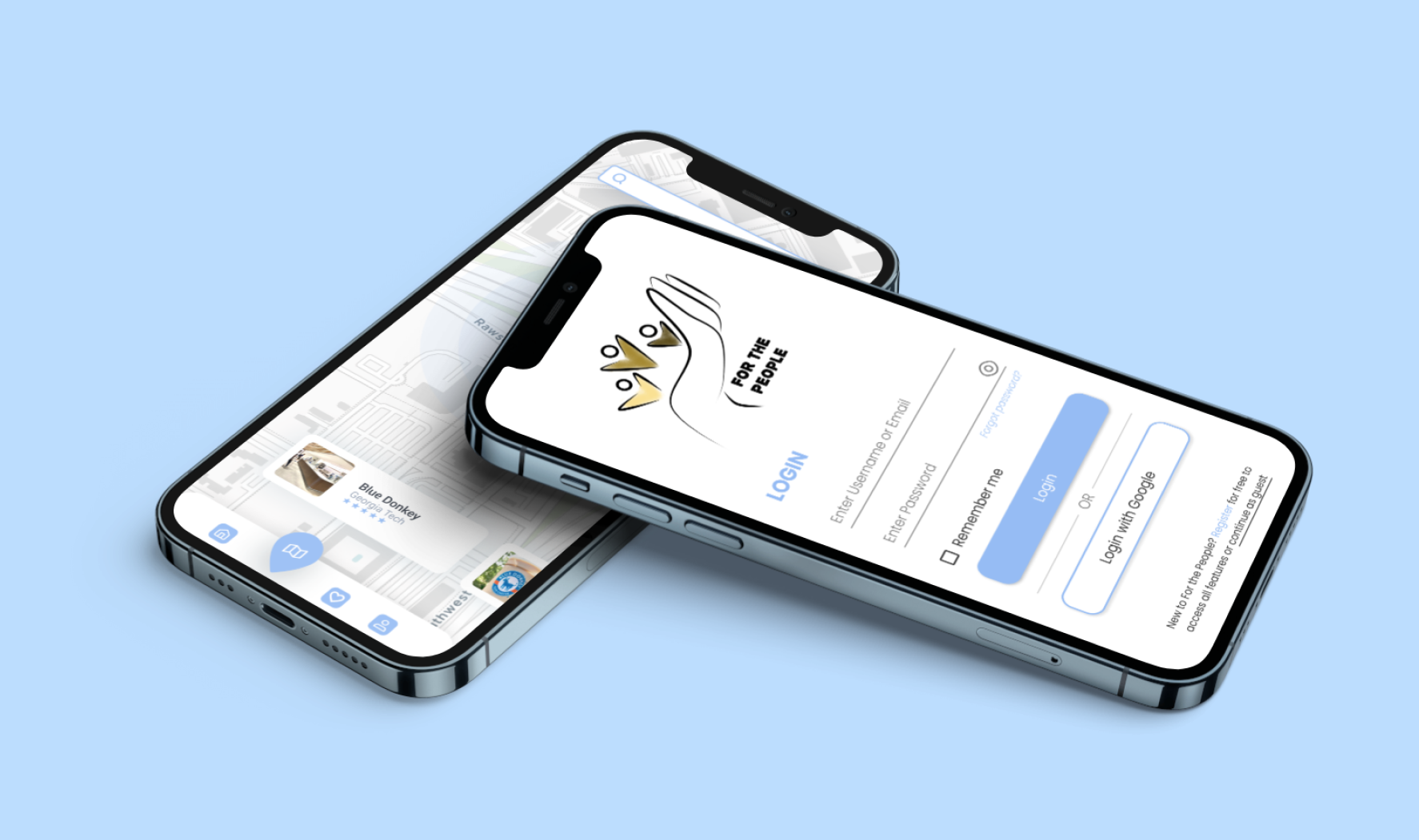
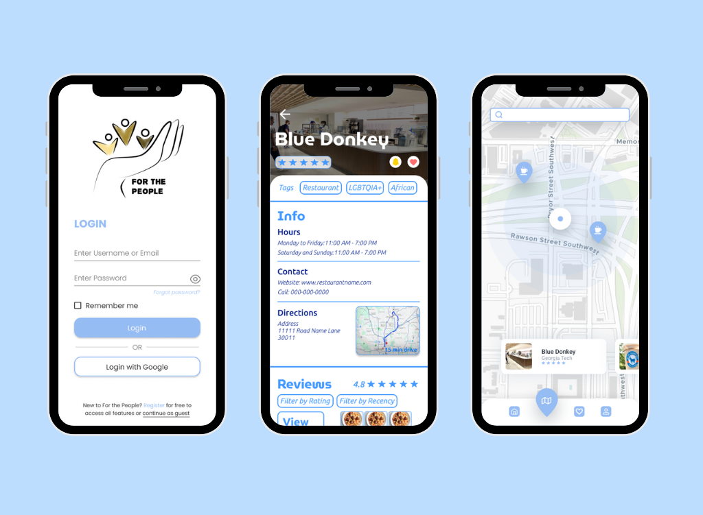
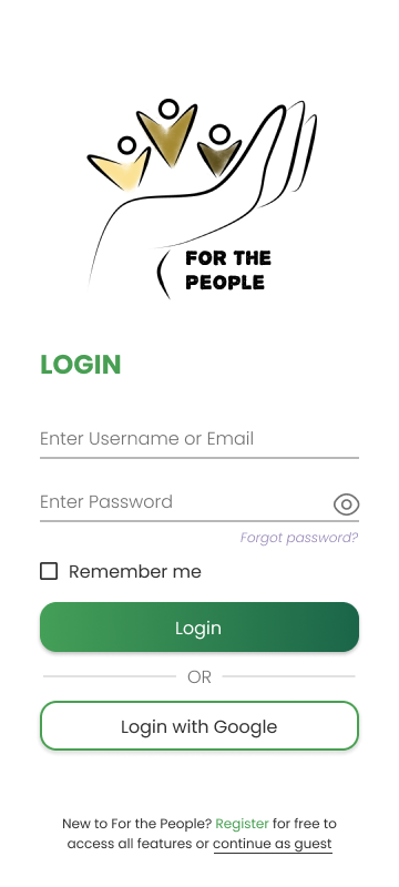
Our client had a specific vision for this app that we really wanted to bring to life. After extensive discussion, we created our lo-fi with a minimalistic charm that would have easy access to everything the user would need.
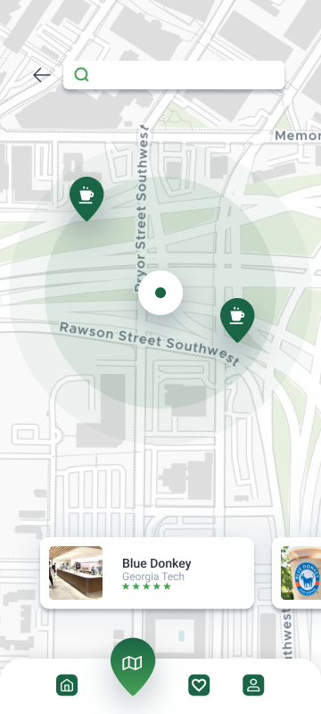
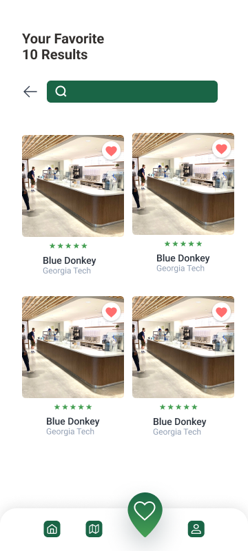
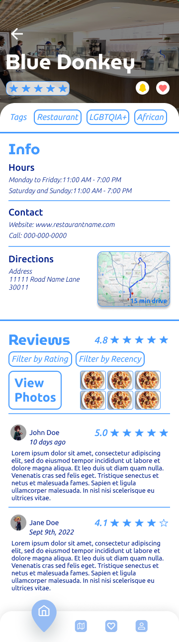
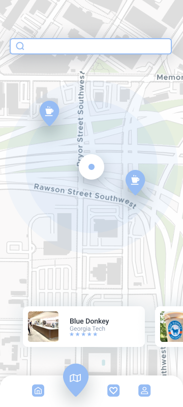
The key features our client wanted on this app was map discoverability, filters for socioeconomic groups, and a favorites section.
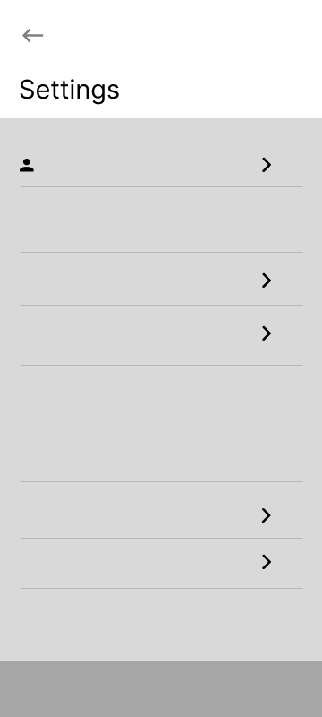
Lo-fi
Hi-fi


After finishing our first iteration of our hi-fi, we had testing groups go through a Maze prototype of our app to see what interactions were unclear. We had the users test five tasks:
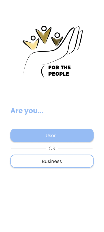
1. Login into our app. Assume you are already a member.
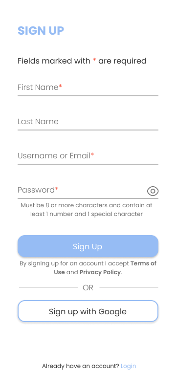
2. Sign up for a business account.
3. Go to the notifications page and turn off your notifications.
4. Search up a restaurant.
5. Navigate to the favorites page and favorite a restaurant.
Findings
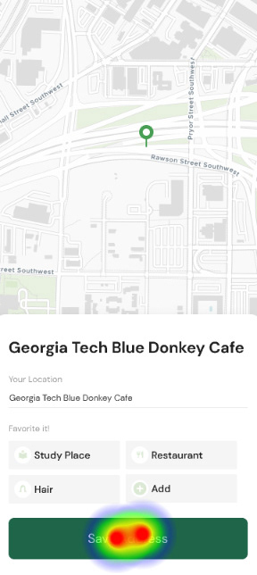
We found that tasks 1, 3, and 5 had success rates of over 90%. We concluded that these functions needed little to no adjustment when moving forward in our final designs of the app. However. we had high misclick rates overall because we did not implement everything as a button.
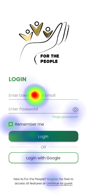
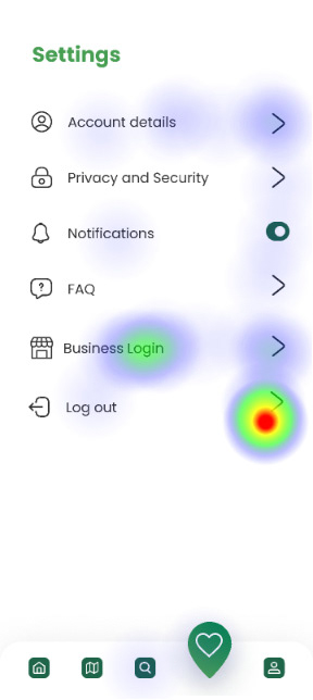


We had the lowest success rate in our task 4: Sign up for a business account. This task had a 33.3% direct success rate and a 59.8% misclick rate.
Changes
From the research we conducted, we came out with a few key changes we should implement: a more intuitive business login method, functionality for everything that appears as a button, and visual clarity in our selection of colors. Additionally, our client wanted some visual changes, mainly pertaining to the aesthetics of the app.

Our most noticeable change is the colors palette. Our client decided that a green would overlap with competition like UberEats, Beli, and Too Good To Go. Moreover, we strayed away from assigning each socioeconomic group to a unique color. Some groups simply did not have a representative color, and some colors were too similar. Instead, we created a traditional filter that has recommendations unique to the user.
These were the last changes we made to this developing app. The development of this app was handed off to our client in May 2024.