This project was a reimagining of an existing project done by a previous group of Georgia Tech students. It was a project that was displayed on a media bridge, where thousands of students walk each day.
Original Video
Redefining Heat Vulnerability
The original visualization we were given was a fully text based visualization that generalized the issue of heat. We analyzed the pros and cons of each of the visual choices used and these were our conclusions.
This choice of bending the words was an interesting concept that visually showed the progression of "danger" with curviness. However, the legibility is the biggest issue in this frame, especially for longer words.


Using color to show vulnerability and showing each stage one by one was very effective in relaying information in a interesting and evocative way. This gave more time for the viewer to individually look at each word while giving a representation of how vulnerable Atlanta is as a whole.
From our analysis of the original visualization, we came to the conclusion that we wanted to take design elements and the visual aesthetic to create a more personalized experience for Georgia Tech students. To understand more about how students feel about heat vulnerability, we interviewed students and their personal experiences.
Our primary question we wanted to answer was:
How aware are students about the danger of heat and how does heat affect their day to day lives?
Interviews
From our interviews, students initially thought they did not have much input on this topic, but after asking personalized questions, they had personal experiences. Many students talked about seeing someone have a heat stroke or sweating more than they realize. Additionally, many students we interviewed happened to be from colder states, so Georgia's weather was a big shock to them.
From these interviews, we derived that many students do not actively think about the heat, but do have occasional experiences where it is a risk to them.
"Atlanta is hotter than you think its gonna be"
"In Ponce City, I was sweating and felt dizzy"
"A camp counselor got dizzy and couldn't get back up"
Personalizing The Visualization
The original visualization just used one dataset, so we decided to find our own sources and look into the history of heat risk in Atlanta. We found many articles talking about heat related deaths in Atlanta and we decided to incorporate this into our visualization. We wanted to provoke a new awareness of heat risk for everyone viewing our visualization.
We used the same color palette of the original and kept the text-based aspect of the visualization. We animated the text to ease in slowly, so that the viewer has more time to read the visualization without being overwhelmed by all of the words.

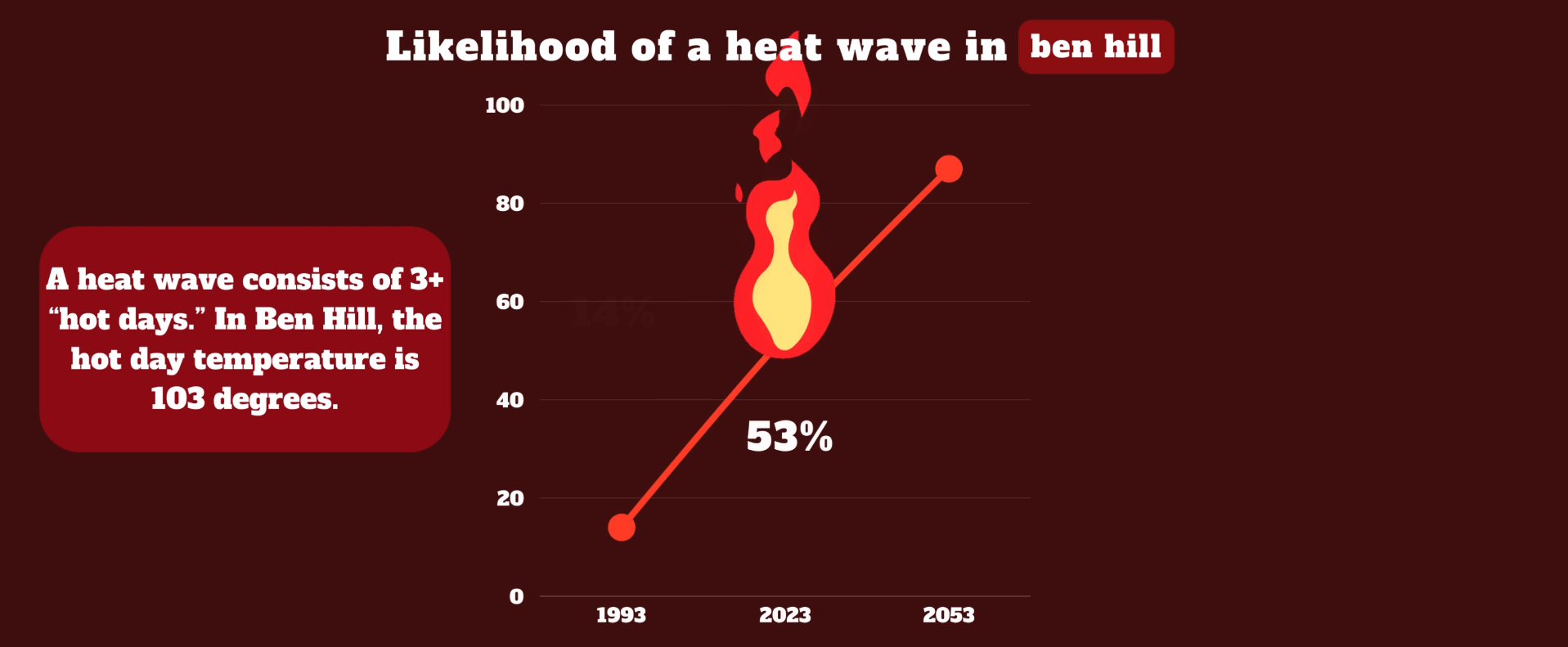
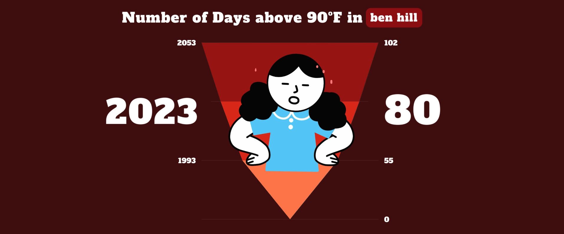
Additionally, we added some visuals to our visualization because with only text, only a specific audience would be reached. We displayed this data in a more traditional graph based format that would be recognizable as well as visual interesting. The data we used for these graphs were specific to an area, Ben Hill. We decided to focus in on one area of Atlanta to personalize it to the local community.
What about Georgia Tech?
We ended our visualization by showing what Georgia Tech is doing to combat heat. Even though it is not a major threat currently, we wanted to establish that it may be in the future, and we need to be aware of the dangers of heat.
Final Visualization